The Russian Photographer Andrey Yakovlev shot a series of kids' photographic works, Back to The Future. Children's naive and immature faces are put into retro spaces to create an oil-painting-like scene through thick colors, fantastic style and tough shading. We extract four groups of key colors from the graceful scenes to present an optimistic attitude. Bright Chateau Rose, Scarlet Ibis and Ming Green are the main colors. Gentle Trophic Peach, Blue Glow and Opaline Green are complementary colors. And the historical arrangement and props in the background inject a delicate retro sense into the scene. (Pantone a:17-2120TPG, b:13-1318TPG, c:16-5930TPG, d:19-4120TPG, e:17-1361TPG, f:13-0746TPG, g:14-0226TPG, h:13-4409TPG)

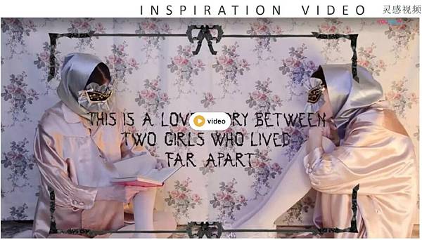
Italian photographer Elena Rendina can always use blended inspiration from props, textiles and painting to create a unique but fascinating world. Her photographic work Solitude My Sweetest Choice tells us a story of love. Two separated girls, who miss each other but can not meet, are doing the same things or helping each other in different spaces. They expect to meet each other in the reality some day, even they are unable to remember each other's faces because of the fleeting time.

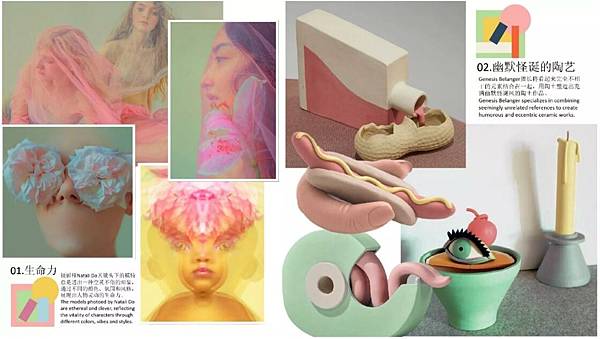
1. The models photoed by Natali Do are ethereal and clever, reflecting the vitality of characters through different colors, vibes and styles. 2. Genesis Belanger specializes in combining seemingly unrelated references to create humorous and eccentric ceramic works.

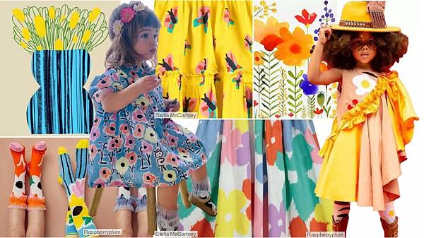
These flower patterns of crayon or watercolor lumps present a lively sense with bright colors. The blurred effect of shading at flower edges presents an artistic sense and improves the hazy fantastic feeling. The childish expressing technique better fits kids' vision, placement prints or all-over prints are both good choices.


 留言列表
留言列表


